
Evolving a MarTech leader’s brand for their next exciting phase of growth and M&A.
Case Study: Enhancing Swoop’s Market Presence
Challenge
Swoop has built a reputation as a leader in healthcare data and analytics. Its HIPAA-certified, NAI-accredited platform uses granular longitudinal data, artificial intelligence, and real-world evidence to -target direct-to-consumer and healthcare provider audiences at scale. The result is coordinated cross-channel DTC-HCP engagement that stands apart in a crowded market.
As the company grew and expanded its offerings, its brand needed to catch up. The visual identity, while strong, had to evolve to reflect innovation and leadership without losing what already worked. Marcella Milliet Sciorra, Chief Marketing Officer, recognized this moment clearly. She championed a strategic refresh that would amplify the company’s innovative spirit without erasing what already worked: the distinctive Mobius logo, the established color palette, and a deliberate focus on graphics over live-action or lifestyle imagery.
The goal was clear: enhance market presence, lower barriers for sellers, and build greater visibility with partners.
Swoop’s marketing and sales materials had started to drift. Sales decks, one-sheets, case studies, videos, animations, and the website told a powerful story of performance and trust, yet the execution lacked a single, cohesive framework. Internal teams and external vendors were producing work that felt close but not fully aligned. The brand needed structure that would scale with growth and make every touchpoint feel unmistakably Swoop.
Path
I began with a deep audit of the existing visual identity, messaging, and market perception. From there, I built a refreshed brand strategy grounded in Swoop’s vision, mission, and values. The work stayed tightly focused on evolution rather than reinvention.
Key refinements included:
Optimizing the Mobius logo for animation, backgrounds, and every format from digital to print.
Enhancing the color palette to add depth and flexibility while preserving its foundation.
Refining typography into a clear system for headlines, body text, and callouts.
Reorganizing the full visual system including imagery, icons, and graphic elements into guidelines that are both consistent and scalable.
Deliverables
Comprehensive Brand Style Guide: Delivered a detailed, all-in-one brand style guide that served as the single source of truth for the company. The guide covered logo usage, color palette, typography, imagery, graphic elements, stationery, presentation decks, one-sheets, case studies, video direction, iconography, brand applications, social media guidelines, and more. Partner-contributed sections (brand voice, taglines, website assets, and legal guidelines) were seamlessly integrated to create a unified reference.
Fractional Creative Direction & Ongoing Oversight: Stepped in as fractional Creative Director to provide hands-on leadership and continuity. Delivered oversight across sales decks, collateral, digital content, vendor-produced videos, and animations. Mentored internal teams, led training sessions, facilitated weekly alignment meetings, managed RFPs, and coordinated creative partnerships with illustrators and animators including Oliver Burton, Djordje Varvarin, and Bohdan Mykytiuk.
Hands-On Asset Creation & Practical Implementation: Produced practical, ready-to-use assets including social tile templates, Canva and PowerPoint resources, illustrations, CGI animation direction, and revised case studies.
Every decision remained practical. No over-design. No unnecessary complexity. Just clear systems that let teams move faster and produce better work.
Results
The brand now speaks with one confident voice across every channel. Sales and marketing materials are visually cohesive, strategically sharp, and immediately recognizable as Swoop. The style guide serves as both reference and guardrail, reducing friction for internal teams and external partners alike. Vendor deliverables arrive aligned on the first pass. The fractional creative director relationship continues to evolve, ensuring the brand stays fresh as the company scales.
Most importantly, the foundation brand guideline work has proven durable. Since the core fractional creative director engagement ended, Swoop has seamlessly integrated two new acquisitions and launched three new products. The systems created continue to flex and evolve naturally, maintaining consistency and quality without starting from scratch each time. This ongoing clarity has reinforced the brand’s ability to scale while preserving its distinctive precision and trust.
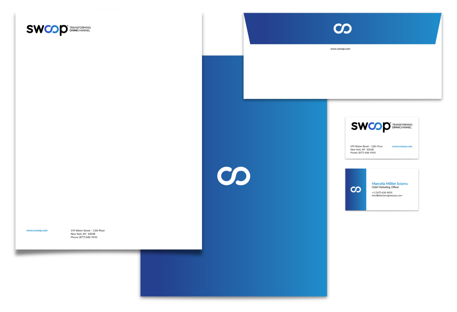
Optical Balancing & Identity Modernization
To elevate the Swoop wordmark into a premium technology identity, the brand’s color logic required a deliberate inversion. The legacy mark buried its most valuable asset: the infinite Mobius. By shifting the “s,” “w,” and “p” to a grounding black, the Mobius was reimagined with a dynamic blue gradient that implies momentum and advanced data connection. To complete the modernization, the rigid graphic underline was removed, and the “Transforming Omnichannel” tagline was re-typeset with elegant, open tracking, creating a seamless and sophisticated corporate asset.
Before
After
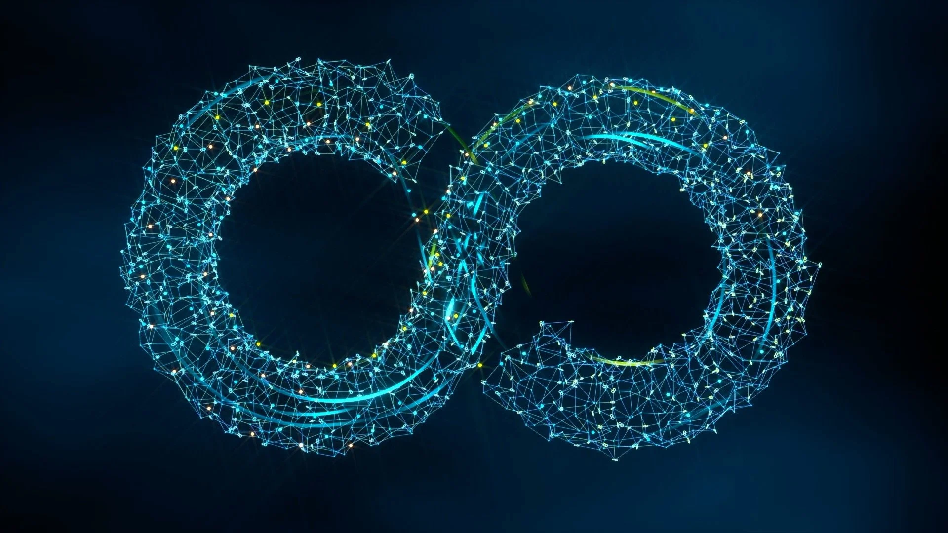
The Mobius Architecture: From Brandmark to Visual Identity
A logo alone cannot carry the narrative weight of a complex machine-learning platform. To build a highly scalable visual ecosystem, the central Mobius was isolated from the primary wordmark and dimensionalized. By re-imagining this flat symbol as a complex, illuminated data network, it transitioned from a simple typographic element into a powerful corporate anchor image. I engaged the incredibly talented Spooky Pooka to develop and execute the CGI. This singular asset now serves as the visual cornerstone for the brand, perfectly mirroring Swoop’s ability to turn abstract data into precise, connected solutions.
From Linear Animation to Scalable Asset Library
Leveraging diverse camera angles within the master 3D render provided a robust visual library. By utilizing distinct perspectives, ranging from the foundational overview to the sophisticated continuous flow, we were able to extend the proprietary visual narrative across the entire marketing ecosystem.


Architecting the Physical Brand: Design at Scale
A premium enterprise identity must translate seamlessly from digital interfaces into compelling three-dimensional space. For Swoop, the brand system was elevated into a highly immersive architectural experience designed to command attention on crowded exhibition floors. The refined Mobius motif was reimagined as a monumental, illuminated overhead anchor—a luminous beacon visible across the halls.
At ground level, proprietary 3D data network imagery was rendered as bold environmental graphics. Unified by structural LED lighting and the brand’s signature high-contrast color palette, the installation transformed abstract AI technology into a tangible, sophisticated, and inviting corporate environment. This was purposefully crafted for presentations, private conversations with clients, and live product demonstrations.
High-Touch Experiential Strategy
To bypass the friction of traditional B2B outreach, a high-touch experiential strategy was deployed for key agency partners. Moving away from standard corporate touchpoints, the Swoop events team leveraged the elevated branding, and executed a series of highly intentional, human-centric micro-activations.
From curated hot chocolate bars and artisanal ice cream carts to pop-up floral “shops,” these are not standard promotional events. They are deliberate, high-value gestures of hospitality designed to foster genuine connection and elevate brand perception.

Identity Design
Dynamic Social Architecture & Brand Framing
Transitioning Swoop’s digital presence from informational to aspirational required a complete overhaul of its social templates. The previous approach, treated social platforms like presentation slides, relying heavily on bullet points and static iconography. To drive deeper engagement, the visual system was rebuilt around the brand's foundational geometry. The new architecture utilizes the organic curves of the logo to boldly frame executive leadership, turning corporate announcements into personal invitations.
Before
After

“Rachel has been an invaluable partner throughout my career and this marks the fourth time we have worked together to quickly evolve and elevate a brand — from a Fortune 50 media company to multiple high-growth healthcare startups. What makes Rachel exceptional is her ability to respect and preserve the heritage of a brand while modernizing it in a way that accelerates growth and creates operational clarity for internal teams.continue evolving the brand long after her engagement ends. calls when I need a trusted partner to help transform and scale a brand.”
Chief Marketing Officer, Swoop