
A healthcare-focused AdTech and MarTech outgrew its brand.
Case Study: Elevating DeepIntent’s Brand Expression
Challenge
DeepIntent was rapidly establishing itself as a leader in healthcare-focused AdTech and MarTech, yet its brand expression had not kept pace with its growth, technological sophistication, or expanding product portfolio. The existing identity lacked the polish, flexibility, and strategic clarity needed to position the company as an established player offering advanced products, advisory services, and technological innovations to pharmaceutical and healthcare advertisers. A more dynamic, scalable, and differentiated brand system was required to support sales, marketing, and long-term growth.
Path
I led a comprehensive Brand Expression refresh to evolve both the visual and verbal identity of DeepIntent. The work began with a thorough discovery phase, leveraging prior competitive research to align on internal culture, business goals, audience perceptions, and market positioning. This analysis revealed key opportunities to differentiate DeepIntent as the essential digital transformation bridge connecting healthcare and pharmaceutical brands with high-performing advertising campaigns.
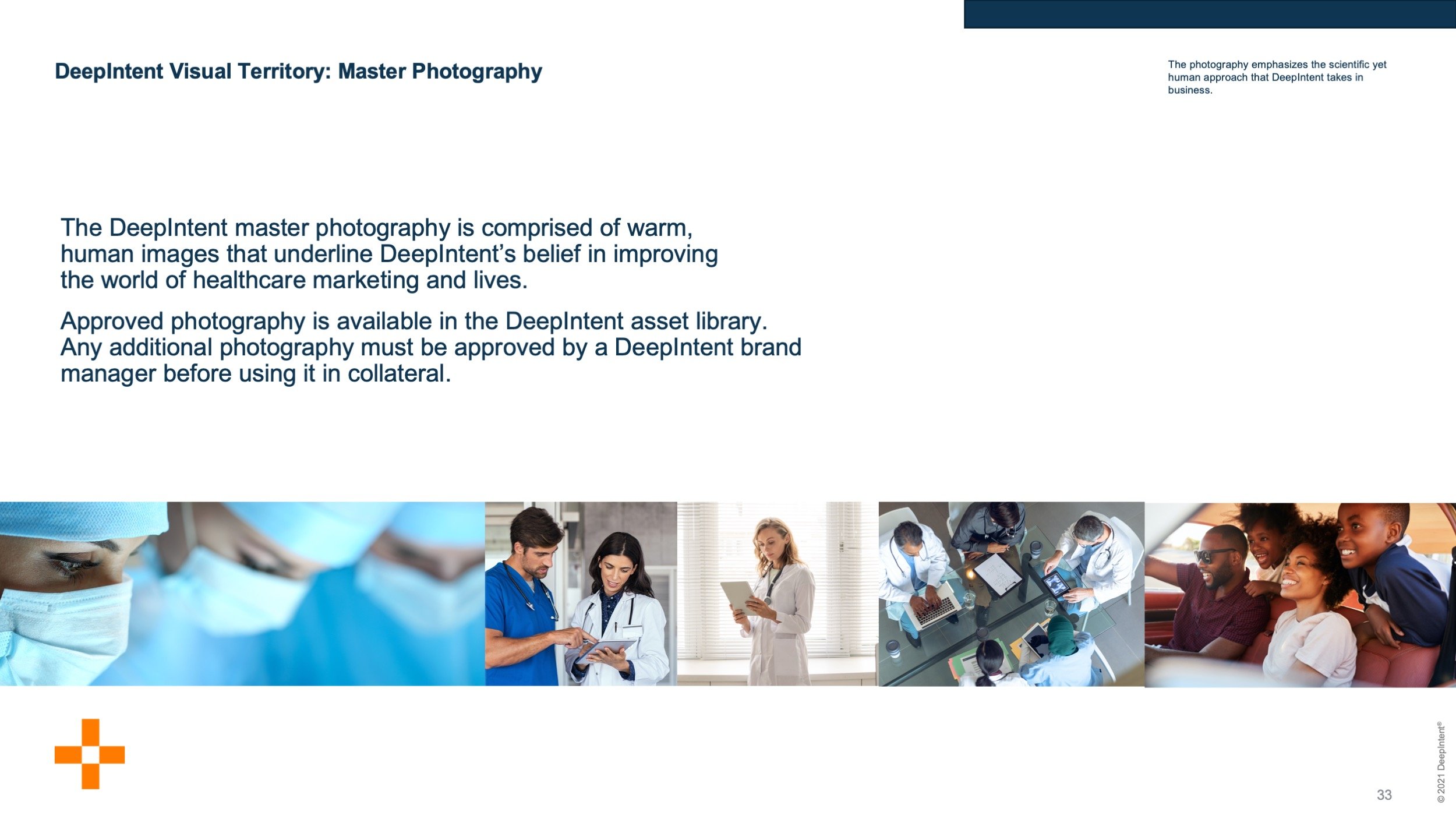
From there, I developed three distinct creative directions, each supported by detailed mood boards and visual explorations. These directions were designed to express DeepIntent’s unique value in a premium, trustworthy, and forward-looking way. The focus remained on building a flexible, scalable brand system including refined logo treatments, typography, iconography, photography guidelines, and presentation tools that could seamlessly expand or contract across the company’s growing product portfolio while clearly standing apart from other niche DSPs.
Deliverables
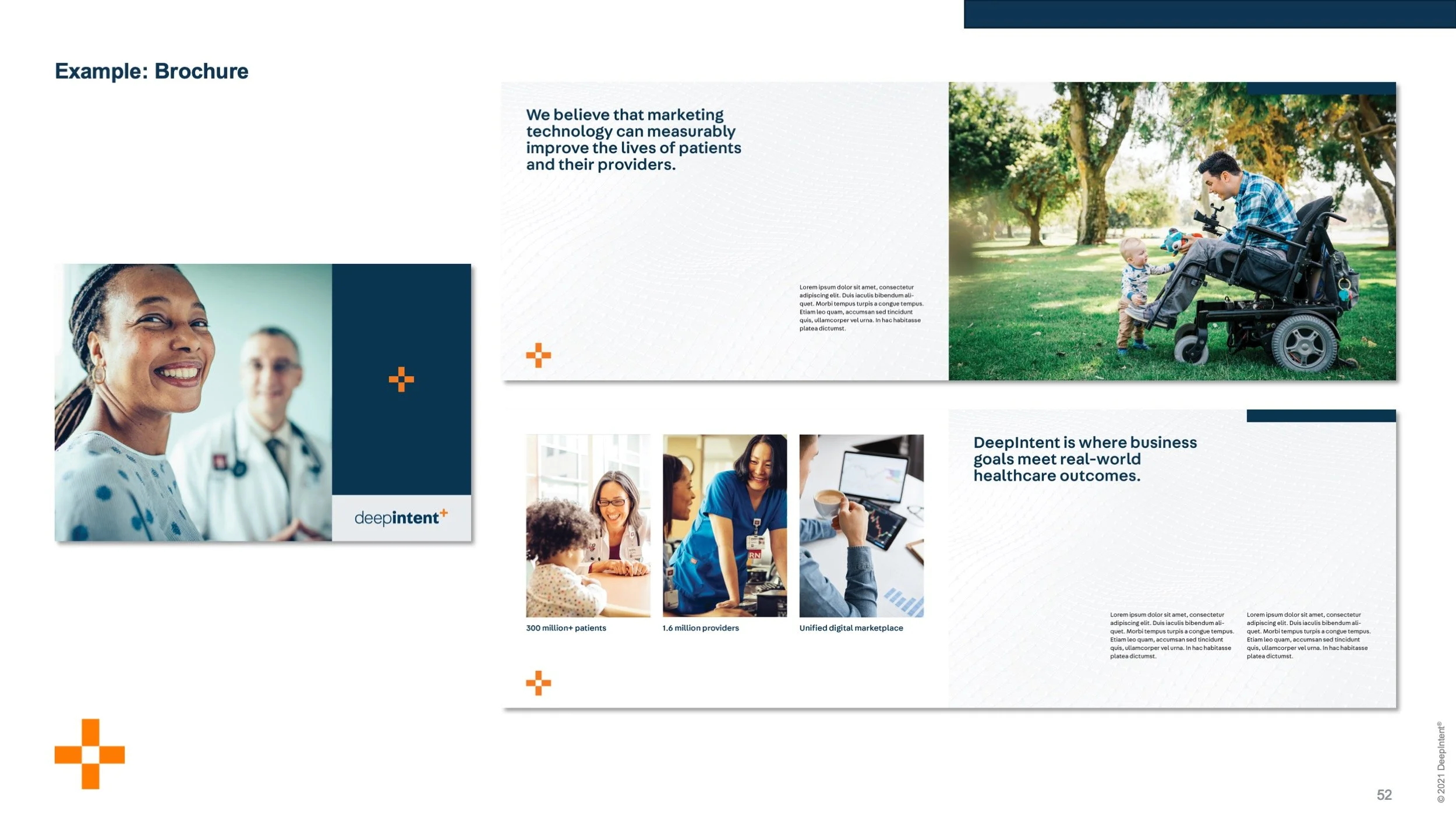
Comprehensive Brand System: Delivered a complete, elevated, and highly usable brand ecosystem for DeepIntent. Created a flexible, scalable visual and verbal identity system including logo treatments, typography, iconography, photography guidelines, voice and tone, and presentation assets that effectively positioned the company as the premium digital transformation bridge for healthcare and pharmaceutical brands while clearly differentiating it from other niche DSPs.
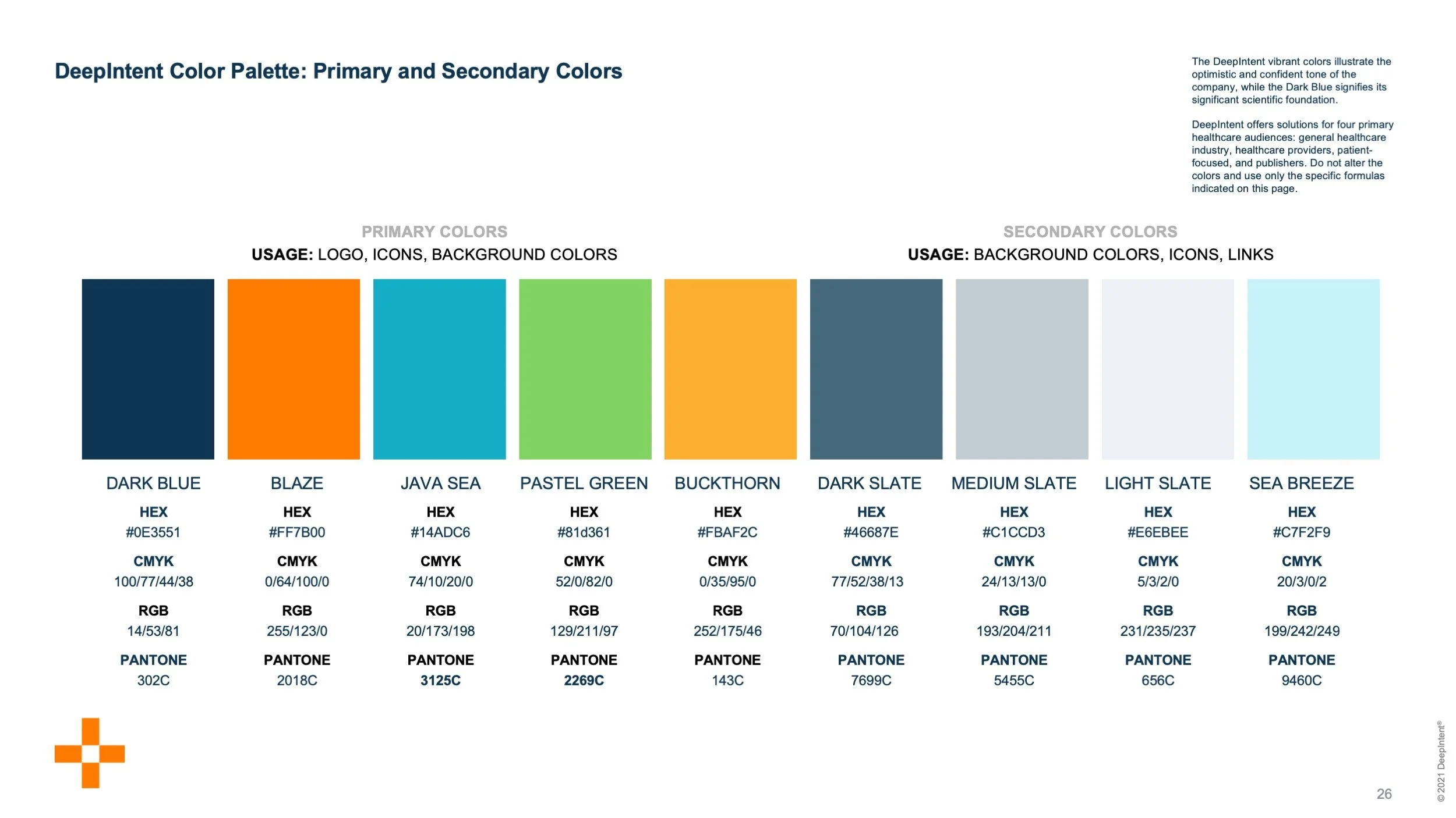
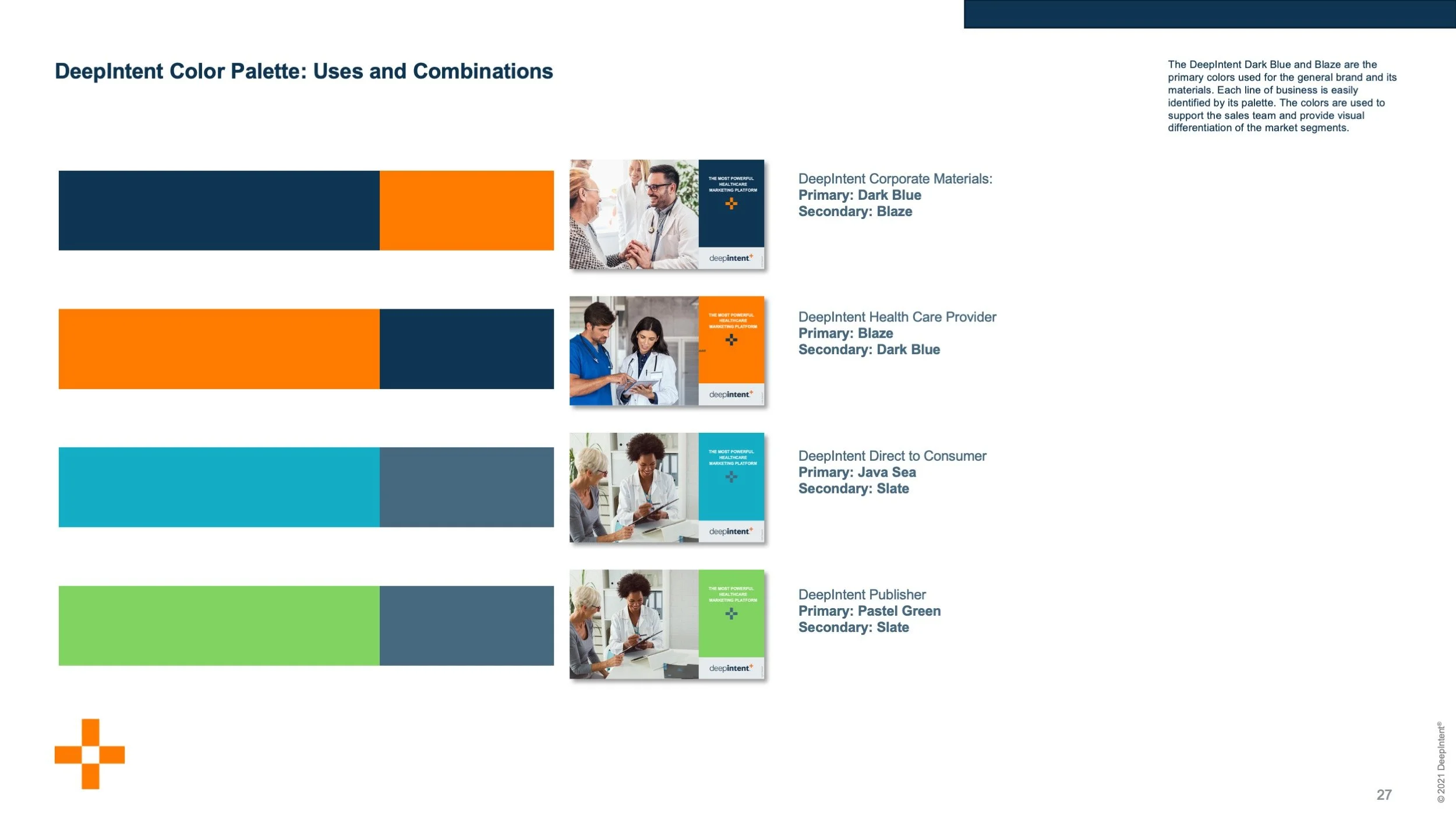
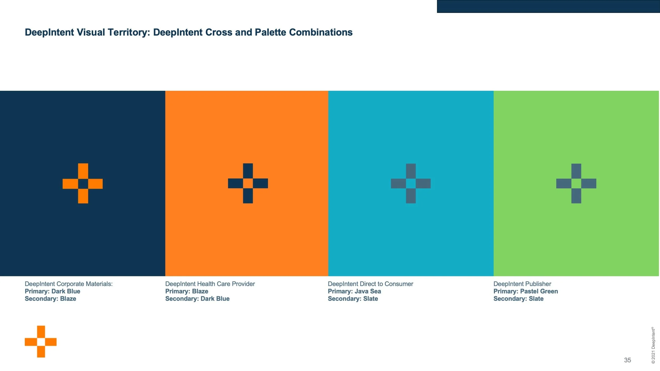
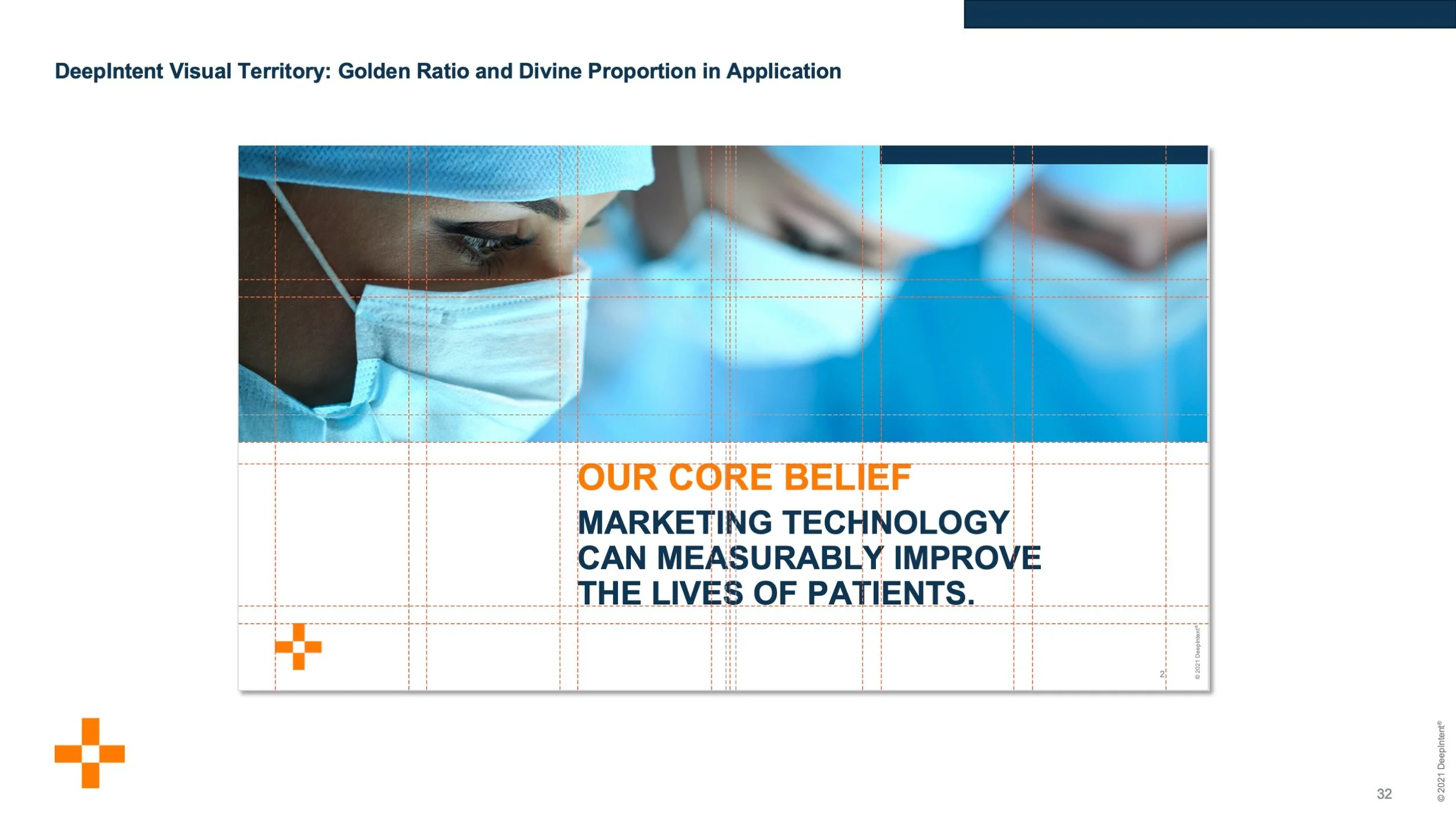
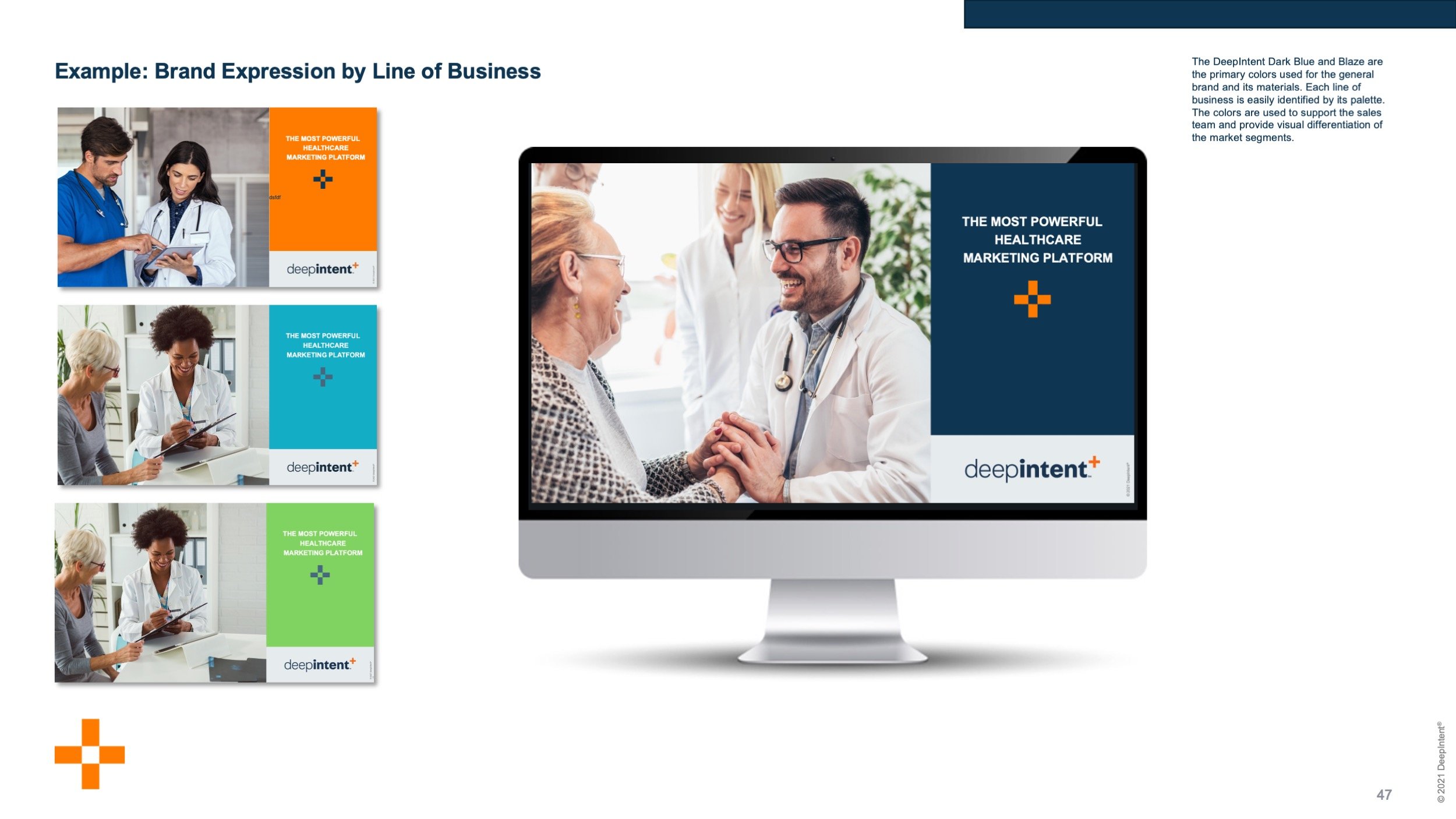
Authoritative Brand Guidelines: Created a comprehensive Brand Guide that became the company’s central reference document. The guide detailed standards for logo usage, color palette, typography, iconography, photography style, and voice and tone to ensure consistent, professional application across all internal and external communications.
Logo Architecture & Product Lockups: Designed multiple logo treatments and variations, along with precise product lockups for DeepIntent and its key offerings. These assets provided the flexibility needed for enterprise sales, marketing, and partnership contexts while maintaining strong brand integrity.
Sales & Presentation Enablement Toolkit: Built a robust, ready-to-deploy presentation and sales toolkit that included executive decks, product and capabilities sell sheets, a custom library of 50 icons, and a suite of scalable templates. These materials empowered the team to communicate complex data-driven advertising solutions with clarity, confidence, and visual polish across all touchpoints.
Results
The new brand expression gave DeepIntent a modern, authoritative, and technologically sophisticated presence that matched the quality of its platform and expertise. The flexible, scalable system enabled consistent, high-impact communications across sales and marketing materials, strengthened differentiation in a competitive AdTech landscape, and provided a clear, professional foundation to support the company’s continued growth and product expansion.
Logo Refinement:
Typographic Optimization & Structural Balance
The transformation of the DeepIntent logo was anchored in evolution, not disruption. By introducing calculated refinements to its form and visual weight, the legacy mark was modernized while maintaining strong, uninterrupted brand recognition. This yielded a cleaner, highly scalable corporate identity system that feels elevated, sophisticated, and perfectly calibrated to the company's growing enterprise capabilities.
Before
The original mark’s superscript "+" floated like an afterthought. It was too small, muted, and disconnected from the wordmark’s ascenders and x-height. This created awkward negative space and made the logo feel optically off-balance at smaller sizes.
After
To resolve the structural disconnect, the symbol was anchored directly into the typography’s grid: top-aligned to the ascenders and base-aligned to the terminal 't' crossbar. After increasing the stroke weight to match the bold letterforms, the color was elevated from a traditional “medical red” to a high-visibility orange. This deliberate chromatic shift moved the brand's perception away from clinical medicine and directly into the dynamic tech space.
The result is a single, cohesive mark that feels intentional and ownable. While preserving brand equity and delivering the clean, scalable precision expected of a modern technology leader.
Rigorous Brand Guidelines Playbook
Following the identity evolution, a comprehensive brand guidelines framework was engineered to protect and govern DeepIntent’s visual equity across all corporate verticals. This scalable playbook anchors the brand's typography, chromatic architecture, and asset application rules, ensuring flawless visual consistency as the company expands its enterprise footprint.

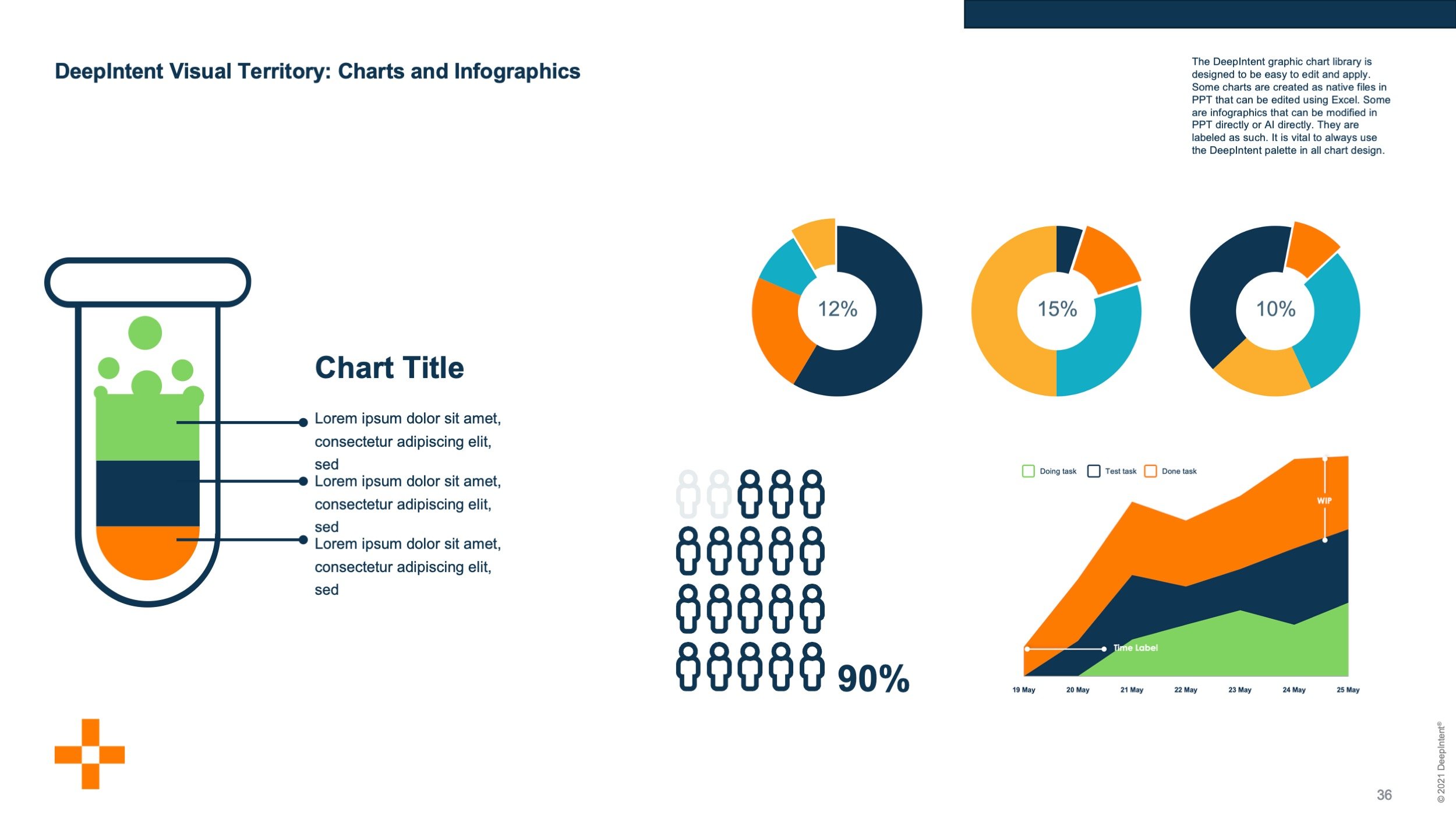
Enterprise Presentation Architecture & Data Storytelling
Empowering internal teams demanded functional, scalable, easy-to-use enterprise tools. A robust library of data visualization frameworks was developed to translate complex market analytics into clear, persuasive visual narratives. By building native, highly editable chart integrations directly into the presentations, DeepIntent’s sales and strategy teams were equipped to rapidly deploy customized reporting, quickly, for sales meetings.
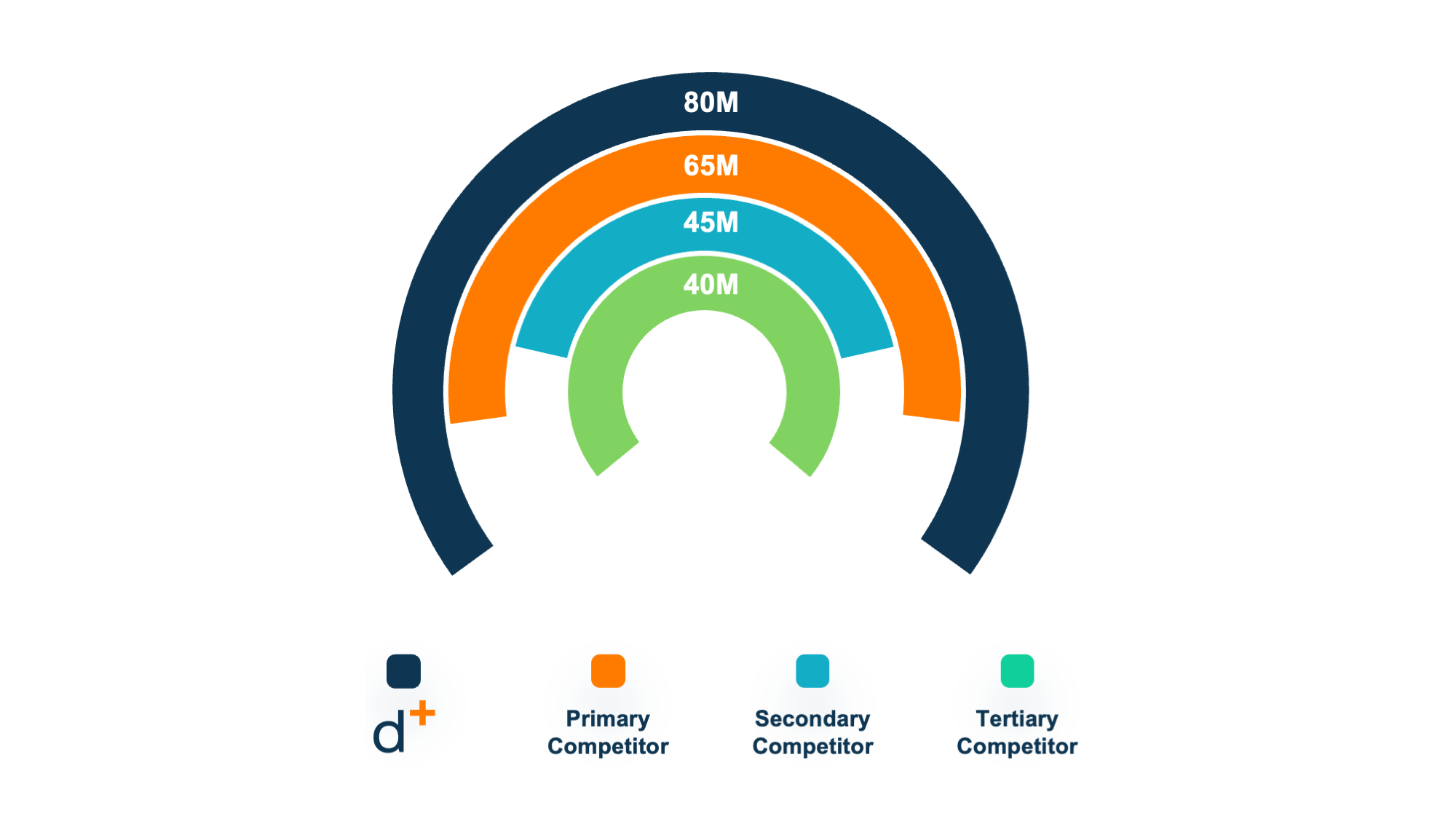
Share Comparison Chart
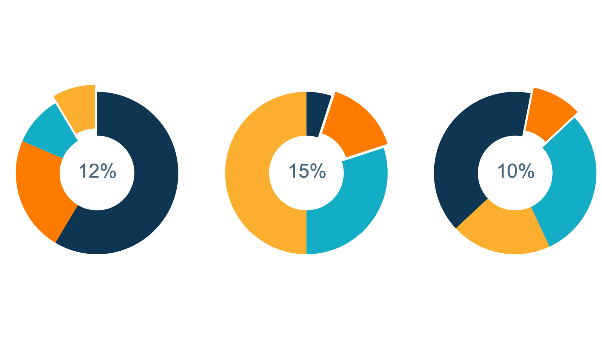
Compare Groups of Stats
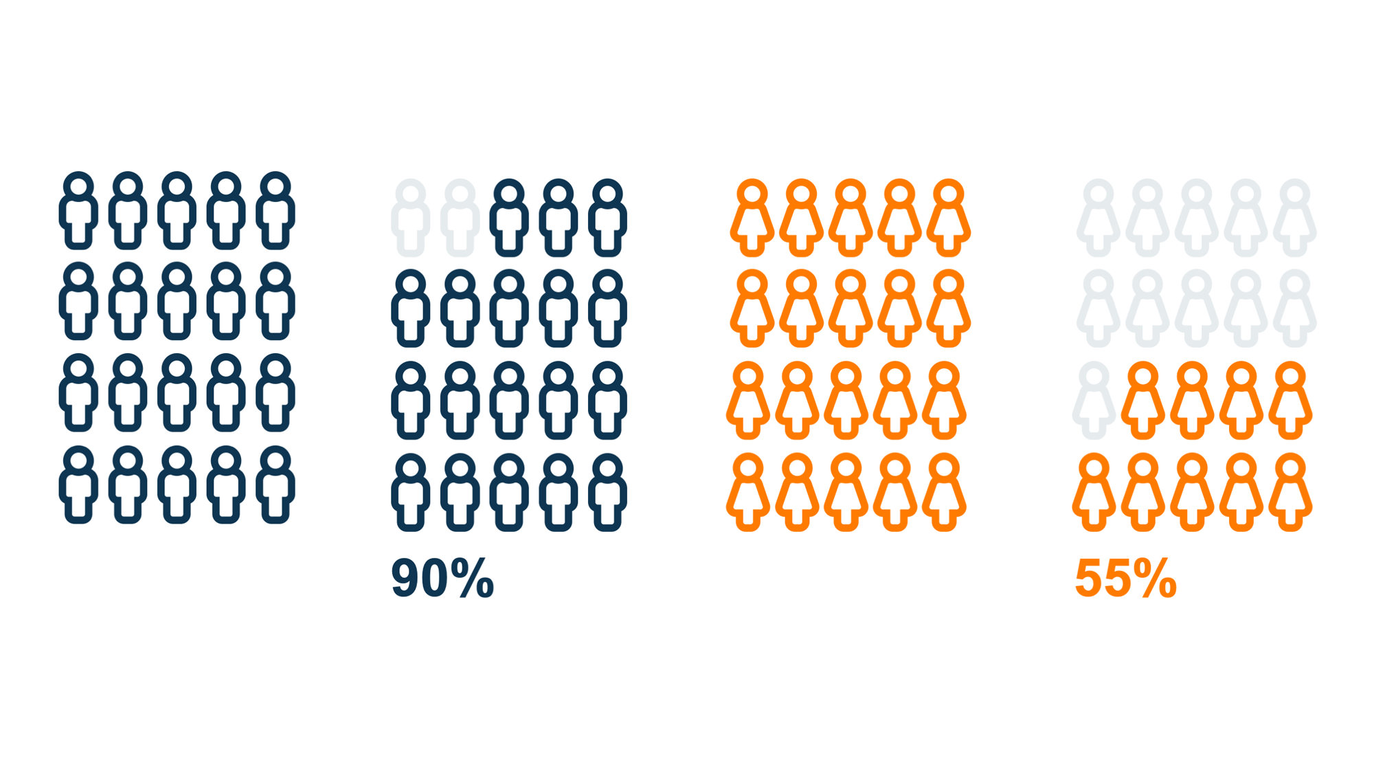
Male/Female — Percentages of Growth
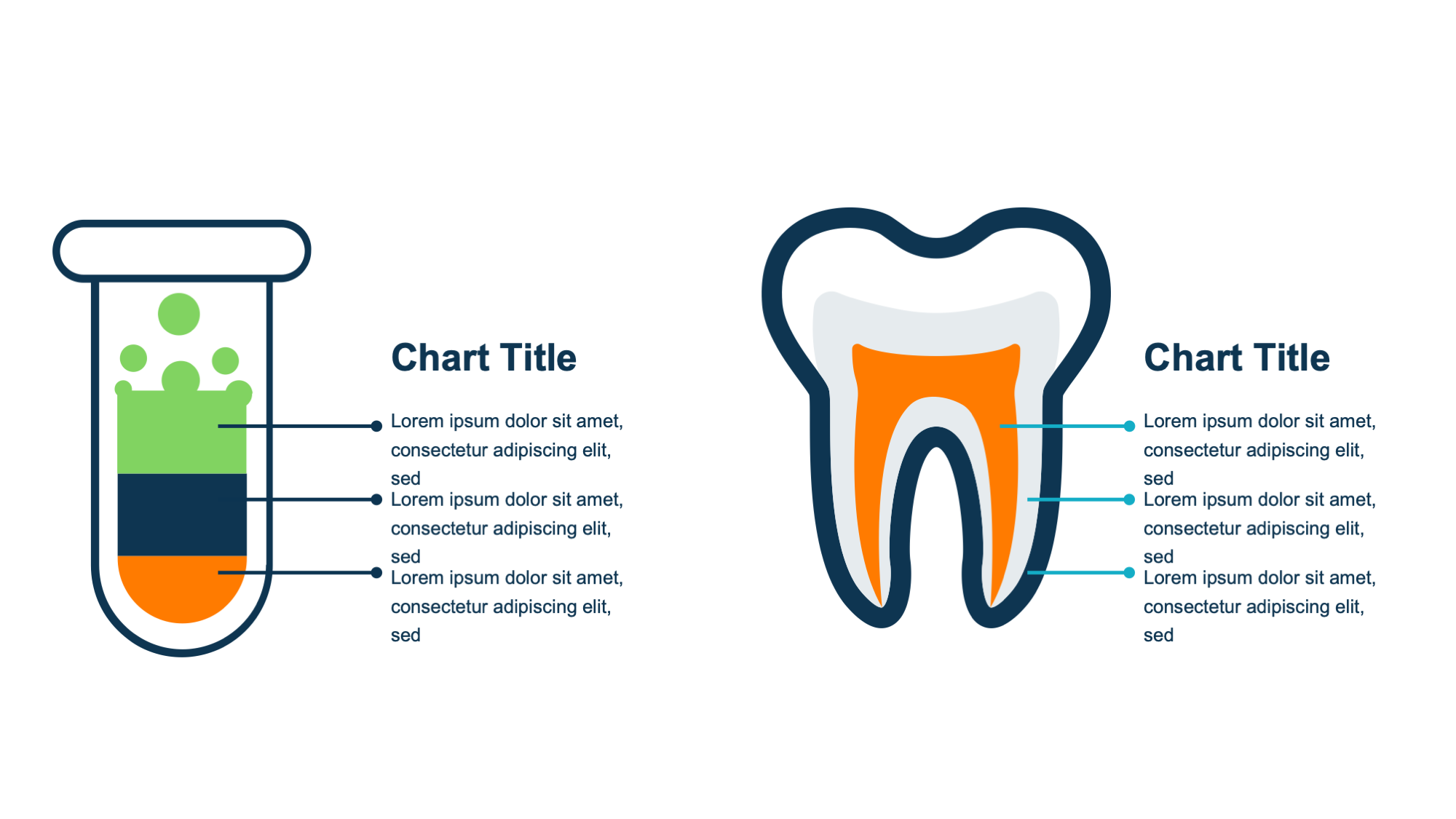
Medical Infographic Elements
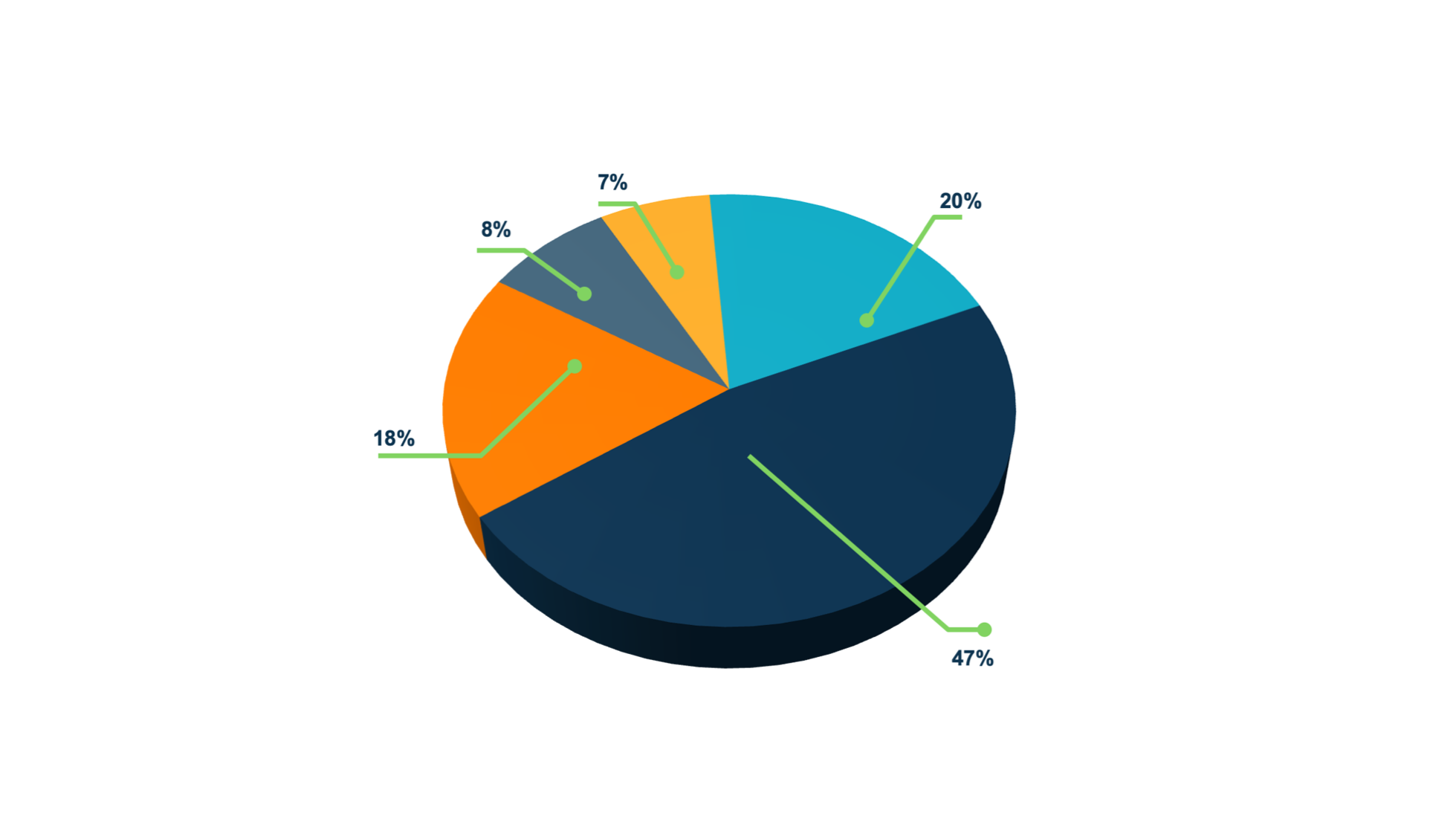
Pie Chart
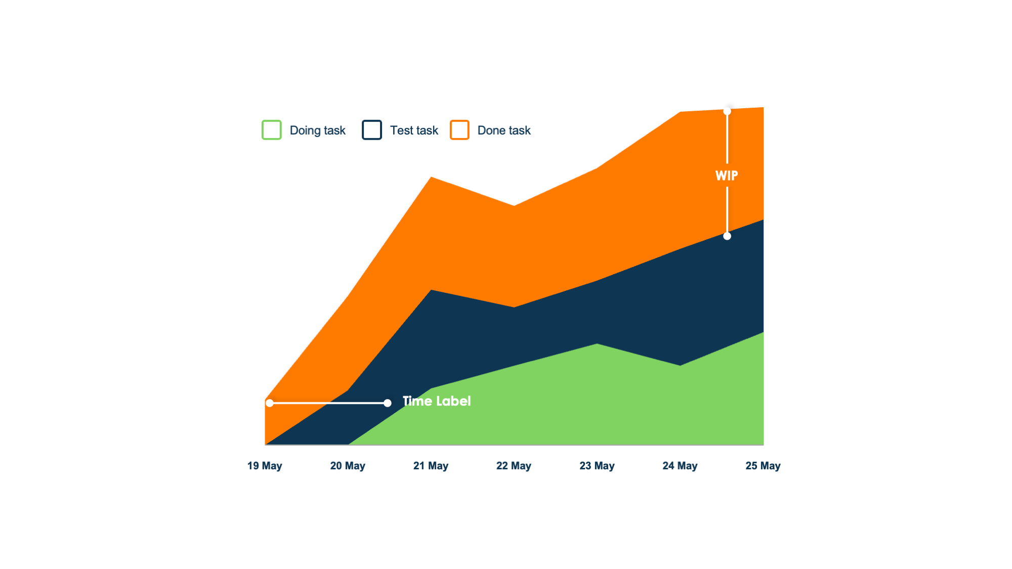
Workflow/Campaign Flow